
 📖Chuyên sâu
A Complete Guide to CSS Concepts and Fundamentals
The five models under the properties — the box, the cascade, inheritance, normal flow and stacking — with every claim measured in a real browser: why your flex row overflows, why z-index is ignored, why a spacer div adds no space, and why a typo in var() wipes your padding instead of falling back.
CuongThai
30 tháng 7, 2026 · 26 phút đọc · 1384 lượt xem
CSS has a reputation for being the language you never quite learn — you learn tricks in it. A padding that behaves, a flex row that finally stops overflowing, a z-index: 9999 that works for reasons nobody investigates. It feels arbitrary because most of us learned the properties and skipped the four or five models underneath them: the box, the cascade, inheritance, normal flow, and stacking.
This guide is those models, and every claim in it is a measurement. I built a page with about thirty test cases, read the results back with getComputedStyle and getBoundingClientRect, and wrote down what the browser actually did — including six places where it contradicted what I was about to write.
Chromium 148.0.7778.280 · viewport 846×998 · devicePixelRatio 2
One honest limitation up front: that's a single engine, and the measuring page ran in a background tab. Layout measurements are reliable there. Timing is not — so you will find no animation or transition benchmarks in this guide, because I couldn't measure them in an environment I trust. Everything quoted is a layout or computed-style value.
The box model is two models, and one line picks
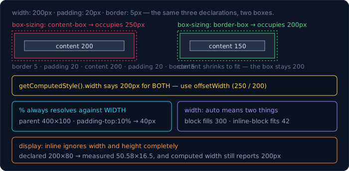
Every element is a rectangle made of four nested boxes: content, padding, border, margin. The argument is about which of them width refers to.
.bm {
  width: 200px;
  padding: 20px;
  border: 5px solid red;
}
Two elements, identical except for box-sizing:
box-sizing     computed width   offsetWidth   clientWidth
content-box    200px            250           240
border-box     200px            200           190
Read the middle column. With content-box — the CSS default — width: 200px describes the content only, and the element occupies 250px: 200 + 20 + 20 padding + 5 + 5 border. With border-box, width: 200px is the whole visible box, so the content shrinks to 150px to make room.
Notice that getComputedStyle().width says 200px in both cases. That's a trap when you're debugging: the computed value reports the width in whichever model is active, so it can't tell you how much space the element takes. offsetWidth (border box) and clientWidth (padding box, so 250 − 10 border = 240) can.
Which is why nearly every codebase starts with this:
*, *::before, *::after {
  box-sizing: border-box;
}
And it needs the universal selector, because box-sizing is not inherited. I checked, since "set it on a container" is advice I've seen:
parent box-sizing: border-box · child declares nothing
→ child computed box-sizing = content-box, offsetWidth = 250
The parent's setting did nothing for the child. Only inherited properties (colour, font, line-height, visibility, and a few dozen others) flow down by default; layout properties like box-sizing, display, width and padding do not.
Percentages resolve against width — including the vertical ones
This one bites everybody once, and it's a two-line experiment:
.pct-wrap  { width: 400px; height: 100px; }
.pct-inner { padding-top: 10%; padding-left: 10%; }
padding-top = 40px padding-left = 40px
padding-top: 10% is 40px, which is 10% of the parent's width (400), not its height (100). The same is true of padding-bottom, margin-top and margin-bottom. It looks like a bug and it's deliberate: resolving vertical percentages against height would make the parent's height depend on the child's padding, which depends on the parent's height.
The useful consequence is the classic aspect-ratio hack, and the modern replacement for it:
.old { padding-top: 56.25%; }        /* 16:9, resolved against width */
.new { aspect-ratio: 16 / 9; }
aspect-ratio: 16/9 with width 200 → 200 × 112.5
Normal flow: what an element does before you style it
Flex and grid get taught first now, which leaves a gap: most of a page is still normal flow, and normal flow has rules that override yours.
.in       { display: inline;       width: 200px; height: 80px; }
.in-block { display: inline-block; width: 200px; height: 80px; }
.blk      { display: block;        width: 200px; height: 80px; }
Same two declarations, three results:
inline        → actual 50.58 × 16.5   (computed width says 200px)
inline-block  → actual 200 × 80
block         → actual 200 × 80
An inline box ignores width and height entirely — it's as wide as its text. And getComputedStyle still reports width: 200px, cheerfully, for a box that is 50.58px wide. That is the second time in this guide the computed value has been useless for finding out how big something is; trust getBoundingClientRect().
Padding on an inline box is half-applied, which is stranger and worth seeing:
.in-pad { display: inline; padding: 20px; }
.line   { line-height: 1; }
computed padding = 20px on all four sides
width of the span      = 73.72px   (horizontal padding counted)
height of its line box = 14px      (vertical padding did NOT push the line)
The padding is really there — it paints, it's in the computed style, it even overlaps the lines above and below. It just doesn't affect line height. If you've ever added vertical padding to a <span> and watched it bleed over neighbouring text, that's this.
Two more normal-flow behaviours that look like bugs:
.fit-blk { display: block; }
.fit-ib  { display: inline-block; }
block        → 300px  (fills its parent)
inline-block → 42.15px (fits its content)
width: auto means two different things depending on display: fill the container, or shrink to fit. That's the whole difference between a <div> and a <span> you gave a background to.
<div class="ib-wrap"><span>a</span> <span>b</span></div>
normal font-size → gap between the two boxes 8.43px
parent font-size:0 → gap 0px
That gap is not margin. It's the space character in your HTML, rendered because inline-level boxes sit in a line of text. Flex and grid don't render whitespace between children, which is one of the underrated reasons to use them for layout.
And the classic mystery gap under an image:
<div> wrapping an <img> 40px tall
default                → box 46.9px tall
img { vertical-align: bottom } → box 40px
parent { display: flex }       → box 40px
The extra 6.9px is descender space below the baseline, because an inline image sits on the text baseline by default. Neither margin: 0 nor display: block on the wrapper touches it; vertical-align or a flex parent does.
The cascade decides, and specificity is only one of its rounds
"Specificity" gets treated as the whole story. It isn't; it's one round in a knockout. When two declarations both apply, the browser compares them in this order and stops at the first difference:
- Origin and importance — UA styles, then user styles, then author styles;
!importantreverses that ordering. - Cascade layers — later layers beat earlier ones. Unlayered author styles beat all layers. With
!important, this order also reverses. - Specificity — the (id, class, type) triple.
- Source order — last one wins.
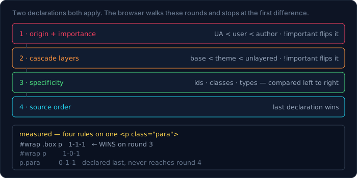
Let's measure each round. Five rules, all targeting the same <p class="para">:
#wrap p       { color: rgb(1, 1, 1); }   /* 1-0-1 */
.box p        { color: rgb(2, 2, 2); }   /* 0-1-1 */
#wrap .box p  { color: rgb(3, 3, 3); }   /* 1-1-1 */
p.para        { color: rgb(4, 4, 4); }   /* 0-1-1, declared last */
winner: rgb(3, 3, 3)
#wrap .box p wins with one id, one class, one type. Note that p.para being declared last did not save it: source order is round 4, and it never got there because round 3 separated them.
Specificity is three numbers compared left to right, not a single score:
- ids —
#header - classes, attribute selectors and pseudo-classes —
.card,[disabled],:hover - types and pseudo-elements —
div,::before
Left to right means no amount of the right beats one of the left. Ten classes lose to one id:
.dup.dup.dup .dupTarget { color: rgb(21, 21, 21); }   /* 0-3-0 */
#oneId .dupTarget       { color: rgb(22, 22, 22); }   /* 1-0-0 */
winner: rgb(22, 22, 22)
And when specificity genuinely ties, round 4 decides:
.tie-a .tie { color: rgb(11, 11, 11); }
.tie-b .tie { color: rgb(12, 12, 12); }
winner: rgb(12, 12, 12)
Both are 0-2-0, the element has both ancestors, so the later declaration wins. This is the whole reason "just move my rule further down the file" works, and the reason it stops working the moment someone adds an id.
:where() is zero, :is() takes the maximum
These two look interchangeable and behave oppositely, which makes them the most useful specificity tools in modern CSS.
:where(#wrap .box) p.zero { color: rgb(9, 9, 9); }
That selector contains an id, so you'd expect 1-1-1 and a win. Measured:
→ rgb(3, 3, 3)
It lost. :where() contributes zero to specificity no matter what's inside it, so the rule is only 0-1-1. That's what makes it right for library defaults and resets: you can write a broad selector that any single class in application code can override.
:is() does the opposite — it takes the specificity of its most specific branch, whether or not that branch is the one that matched:
:is(#nope, .cls) .isTest { color: rgb(5, 5, 5); }   /* 1-1-0 */
.a.b.c .isTest           { color: rgb(6, 6, 6); }   /* 0-3-0 */
winner: rgb(5, 5, 5)
#nope doesn't exist anywhere in the document. It still set the specificity of the whole rule to 1-1-0, and 1-1-0 beats 0-3-0.
That measurement cost me a detour worth passing on. My first run returned rgb(6, 6, 6) — the opposite — and for a minute I thought the rule was different from the spec. It wasn't: my test element was <div class="a b c">, which matches neither #nope nor .cls, so the :is() rule never applied at all. A rule that loses might not be losing on specificity — check that it matches first. In devtools, a rule that doesn't match doesn't appear struck through; it doesn't appear at all.
Cascade layers change the order entirely
@layer is the round above specificity, which makes it the first real fix for the "we can't override the component library" problem.
@layer base, theme;
@layer theme { .layered { color: rgb(20, 20, 20); } }
@layer base  { .layered { color: rgb(10, 10, 10); } }
div .layered { color: rgb(30, 30, 30); }   /* no layer */
winner: rgb(30, 30, 30)
Three things there. The layer order is set by the @layer base, theme; statement at the top, not by where the blocks appear — theme beats base even though the base block is written second. And the unlayered rule beats both, despite being the weakest selector of the three. Unlayered author CSS is the strongest layer, always.
Now the part that surprises people who just learned the above:
@layer base  { .imp { color: rgb(40, 40, 40) !important; } }
@layer theme { .imp { color: rgb(50, 50, 50) !important; } }
winner: rgb(40, 40, 40)
With !important, the layer order inverts: base now beats theme. It's consistent once you see the logic — !important reverses the origin ordering too, so that a user's important declaration can beat an author's — but it means !important inside layered CSS does the opposite of what your mental model says.
Inline styles and !important
.imp-cls { color: rgb(1, 1, 1) !important; }
<div class="imp-cls" style="color: rgb(2, 2, 2)">
<div class="imp-cls" style="color: rgb(3, 3, 3) !important">
first  → rgb(1, 1, 1)
second → rgb(3, 3, 3)
An inline style beats any selector — it's effectively a specificity above ids. But a stylesheet's !important beats a plain inline style, and an inline !important beats that. The practical order, weakest to strongest, for author CSS:
selector < inline style < selector !important < inline !important
Inheritance, and the four keywords that steer it
Some properties inherit, most don't. The four global keywords let you say what should happen regardless:
.inh-parent { color: rgb(7, 7, 7); }
.inh-a { color: inherit; }
.inh-b { color: initial; }
.inh-c { color: unset; }
.inh-d { color: revert; }
inherit → rgb(7, 7, 7)
initial → rgb(0, 0, 0)
unset   → rgb(7, 7, 7)
revert  → rgb(7, 7, 7)
inherit— take the parent's computed value, even for a non-inherited property.initial— the property's spec-defined initial value. Forcolorthat's black, not the parent's colour and not the browser's default text colour.unset—inheritfor inherited properties,initialfor the rest. It's the "act natural" keyword.revert— roll back to what the previous cascade origin would have produced (here, the UA stylesheet, which doesn't setcoloron adiv, so the inherited value survives).
initial returning pure black is the one that catches people. If you want "whatever this would have been", you want unset or revert.
em compounds. rem doesn't. And em compounds from the parent
html { font-size: 16px; }
body { font: 14px/1.6 ui-monospace, monospace; }

.em-1, .em-2, .em-3   { font-size: 1.5em; }
.rem-1, .rem-2, .rem-3 { font-size: 1.5rem; }
Three nested levels of each:
1.5em  × 3 levels → 47.25px
1.5rem × 3 levels → 24px
I predicted 54px for the em chain: 16 × 1.5³. The measurement said 47.25px, which is 14 × 1.5³. The chain doesn't start at the root — it starts at the parent, and body sets its own font-size: 14px in that font shorthand. rem ignores all of it and resolves against html's 16px every time: 16 × 1.5 = 24px at every level.
That's the honest summary of the two units. em is relative to this element's font size (or its parent's, when setting font-size itself); rem is relative to the root. Use em when you want something to scale with the text it sits next to:
.pad-em { font-size: 20px; padding: 1em; }
padding-top = 20px
padding: 1em resolved against this element's own 20px, not the parent's.
line-height is the property where units change inheritance
.lh-unitless { line-height: 1.5;   font-size: 10px; }
.lh-unit     { line-height: 1.5em; font-size: 10px; }
.lh-child    { font-size: 30px; }
parent line-height:1.5   → child at 30px gets 45px
parent line-height:1.5em → child at 30px gets 15px
A unitless line-height inherits as the number, so each descendant multiplies it by its own font size. 1.5em computes to 15px on the parent and inherits that absolute 15px, which then clips 30px text. This is why every style guide says to use unitless line heights, and now you have the two numbers that show why.
Margin collapse
Adjacent vertical margins merge instead of adding. This isn't a quirk, it's normal flow doing what it was designed to do — and it has four distinct cases.
.mc-a { margin-bottom: 30px; height: 10px; }
.mc-b { margin-top: 20px;    height: 10px; }
measured gap between them: 30px
Not 50. The larger margin wins and the smaller disappears entirely. Now a parent whose only child has margins:
.mc-parent { }                       /* nothing */
.mc-child  { margin: 40px 0; height: 10px; }
parent height: 10px
The child's 40px margins escaped the parent and became the parent's own margins. The parent is 10px tall — exactly the child's height — which is the "my background doesn't cover my content" bug.
Two ways to stop it, and they behave differently:
parent + overflow: hidden   → height 90px   (10 + 40 + 40)
parent + padding-top: 1px   → height 51px   (1 + 40 + 10)
overflow: hidden makes the parent a block formatting context, and margins never collapse through a BFC boundary — both margins are contained, so 90px. padding-top: 1px only puts something between the parent's top edge and the child's top margin, so the top margin is contained (+40) but the bottom one still escapes: 1 + 40 + 10 = 51px. Half a fix is a real possibility here.
And the case that looks like a browser bug:
<div class="mc-a"></div>   <!-- margin-bottom: 30 -->
<div class="mc-empty"></div>   <!-- margin: 25 0, no content -->
<div class="mc-b"></div>   <!-- margin-top: 20 -->
measured gap: 30px
The empty div has no height, no border and no padding, so its own top and bottom margins collapse through it, and all four margins in play collapse into one: max(30, 25, 25, 20) = 30. An element you added specifically to create space created none.
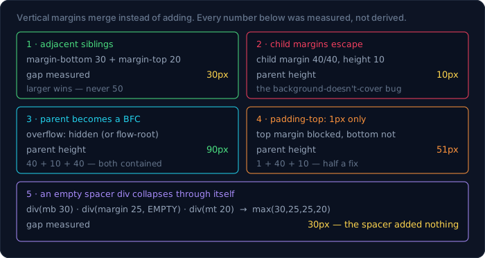
The rules worth memorising: collapse happens only vertically, only in normal flow (never in flex or grid), and only when nothing separates the two margins — no border, no padding, no content, no BFC.
Floats and the block formatting context
Floats are legacy for layout, but BFCs are not, and floats are the clearest way to see one.
.fl-parent { border: 1px solid #333; }
.fl        { float: left; width: 40px; height: 60px; }
parent height: 2px (just the two borders)
The float is out of flow, so it contributes nothing to its parent's height. The modern fix is a single declaration, no clearfix pseudo-element:
.fl-parent { display: flow-root; }
parent height: 62px
display: flow-root means "be a block, and establish a BFC" — it's overflow: hidden's effect without the side effect of clipping. A BFC is what contains floats, stops margin collapse, and stops an element from overlapping a sibling float. When someone tells you overflow: hidden "fixes" a layout, this is almost always what they've stumbled into.
Flexbox: two defaults cause most of the bugs
Flexbox is well designed and mostly intuitive. The exceptions are min-width/min-height, and flex-basis vs width.
min-width: auto is why your flex item won't shrink
.flex { display: flex; width: 300px; }
.long { white-space: nowrap; }
<div class="flex">
  <div class="long">a-very-long-unbreakable-token-here</div>
  <div>sib</div>
</div>
default     : long 286.58px + sib 25.29px = 311.87px in a 300px box → OVERFLOW
min-width:0 : long item 274.71px + sibling 25.29px = 300px
computed min-width of a flex item = auto
A flex item's min-width defaults to auto, which resolves to its min-content size — for unbreakable text, the full width of the text. flex-shrink can't go below it, so the row overflows its container by 11.87px instead of shrinking. Setting min-width: 0 releases the floor and the row fits exactly.
This is the root cause of "my flex layout overflows on mobile" and of every ellipsis that refuses to appear. And the fix has to go on every flex level, not just the innermost:
min-width:0 on the inner item only → item 286.58px (outer box 260)
nested flex, min-width:0 on the middle level too → item 260px
The middle element was itself a flex item of the outer container, with its own min-width: auto floor. One min-width: 0 looked like it should be enough; two were needed. If your ellipsis works in isolation and not in the app, count your flex levels.
The same trap, vertically, means something slightly different
.col { display: flex; flex-direction: column; height: 100px; }
With a child containing six lines of real text:
default (min-height:auto) → child 134.39px, scrollHeight 134 → OVERFLOW
+ min-height:0 + overflow:hidden → child 100px, scrollHeight 100
Here's where I was wrong the first time. My initial test gave the child height: 200px and one character of text, and I expected min-height: auto to hold it at 200. It didn't — the child shrank to 100px and nothing overflowed. auto means min-content, not the height you declared. A one-line child has a min-content height of about 21px, so there was nothing to stop the shrink. The trap only appears when the content is bigger than the box, which is exactly when it matters and exactly when a synthetic test misses it.
flex-basis beats width
.fb-w { width: 100px;         flex: 0 0 auto; }
.fb-b { flex: 0 0 100px;      width: 300px; }
width:100px           → 100px
flex-basis:100 + width:300 → 100px
flex-basis is the size the algorithm starts from, and it overrides width on the main axis. So flex: 1 — which expands to flex: 1 1 0% — silently zeroes the basis, which is why adding flex: 1 sometimes makes an element with a width collapse.
One flex nicety worth knowing, because it saves a wrapper element:
.ma { display: flex; width: 300px; }
.ma > .push { margin-left: auto; width: 40px; }
pushed item sits 260px from the container's left edge
margin: auto in a flex container absorbs all free space, so margin-left: auto right-aligns one item without touching justify-content or the other children.
Grid: fr is not a percentage
They look equivalent in a two-column layout. They differ the moment there's a gap.
.g-fr  { display: grid; width: 300px; gap: 20px;
         grid-template-columns: 1fr 1fr; }
.g-pct { display: grid; width: 300px; gap: 20px;
         grid-template-columns: 50% 50%; }
1fr 1fr → column 140px · scrollWidth 300
50% 50% → column 150px · scrollWidth 320 → OVERFLOW
1fr means "one share of the space that's left after gaps, padding and fixed tracks": (300 − 20) / 2 = 140. 50% means half of 300 = 150, and then the 20px gap is added on top, so the grid is 320px wide inside a 300px box. fr is a fraction of free space; a percentage is a fraction of the whole. Prefer fr for exactly this reason.
The responsive idiom that removes most media queries:
grid-template-columns: repeat(auto-fill, minmax(120px, 1fr));
resolved: 140px 140px
In a 300px container with a 20px gap, that fits two columns and each takes a full share. Widen the container and it becomes three, then four, with no breakpoints. Use auto-fit instead of auto-fill when you'd rather have empty tracks collapse.
Sizing that silently does nothing
Four declarations that look like they should work and don't.
height: 50% with an auto-height parent.
parent height:auto  → child 0px (computed 0px)
parent height:200px → child 100px
A percentage height needs a definite height to resolve against. When the parent's height depends on its children, that's circular, so the percentage resolves to auto — and the computed value comes back as 0px, not 50%, which makes it look like your rule was dropped. In a flex container the child stretches instead:
parent 200px + display:flex → child 100px (align-items: stretch)
width: 100% with padding.
.w-wrap { width: 200px; }
.w-auto { padding: 20px; }
.w-100  { width: 100%; padding: 20px; }
width:auto → offsetWidth 200
width:100% → offsetWidth 240   (overflows the parent)
width: auto on a block already fills the parent and subtracts its own padding. width: 100% means 100% of the parent's content box and then adds padding on top. In content-box mode, width: 100% on a padded element always overflows. This is the single best argument for the box-sizing: border-box reset.
text-overflow: ellipsis on its own. It needs three declarations together, and the proof is where the text goes:
.to         { width: 100px; white-space: nowrap; }
.to--ellip  { overflow: hidden; text-overflow: ellipsis; }
.to--noover { text-overflow: ellipsis; }
I hit-tested a point 40px past each element's right edge:
overflow:hidden + ellipsis → hit: the page behind it (text was clipped)
ellipsis, no overflow      → hit: the element itself (text spilled out)
both: scrollWidth 287, rect width 100px
Identical scrollWidth, identical box — the difference is only whether the overflow was clipped, and text-overflow has no effect until it is.
overflow-x: hidden alone. You cannot clip one axis and leave the other visible:
overflow-x: hidden → computed overflow-y = auto
The spec turns the other axis into auto when one axis is not visible, which is why overflow-x: hidden sometimes produces an unexpected vertical scrollbar.
Stacking: z-index, and contexts you created by accident
Two rules explain almost every z-index mystery.
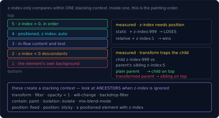
Rule one: z-index does nothing on a position: static element. Measured with a real hit test rather than by eye — a green box with z-index: 999 and a red absolutely positioned box on top of it:
.over-static { z-index: 999; background: green; }   /* position: static */
.under       { position: absolute; inset: 0; background: red; }
elementFromPoint at the centre → the RED box
The green box's 999 was ignored entirely because it isn't positioned. Add position: relative and a z-index: 1 and it wins:
relative + z-index:1 → elementFromPoint → the GREEN box
z-index applies to positioned elements, flex/grid items, and elements that already form a stacking context. On a plain static block it is dead CSS.
Rule two: z-index is only comparable inside one stacking context. And you create stacking contexts without meaning to — transform is the usual culprit:
.sc       { position: relative; z-index: 1; }
.sc-tr    { transform: translateZ(0); }        /* the only difference */
.sc-child { position: absolute; z-index: 999; }
.sibling  { position: relative; z-index: 5; }  /* sibling of .sc */
plain parent      → elementFromPoint hits the CHILD  (999 beats the sibling's 5)
transformed parent → elementFromPoint hits the SIBLING
Same numbers, opposite outcome. In the second case the parent's transform made it a stacking context, so the child's 999 is only meaningful within the parent — and the parent competes with its sibling using its own z-index: 1, which loses to 5. The child cannot escape.
The list of things that quietly create a stacking context is longer than most people expect: transform, filter, opacity less than 1, will-change, backdrop-filter, contain: paint, isolation: isolate, mix-blend-mode, and position: fixed or sticky. If a z-index refuses to work, look at the ancestors, not the element.
Negative z-index goes below the parent's content, not below the parent. I had this wrong and the hit test corrected me:
.neg-parent { position: relative; z-index: 0; background: green; }
.neg-child  { position: absolute; inset: 0; z-index: -1; background: red; }
point over the parent's background only → hits the RED child
point over the parent's text            → hits the TEXT
So the paint order inside a stacking context is: the element's own background and borders first, then negative-z-index descendants, then in-flow content, then positioned descendants. A z-index: -1 child sits above its parent's background and below its parent's text. It does not disappear behind the parent, and it also can't escape past the parent's own stacking context.
Containing blocks: what position is actually relative to
position: absolute positions against the nearest ancestor that is itself positioned — and if there isn't one, it keeps climbing. I measured a child with left: 0; top: 0 against two parents:
parent position:static   → child sits 76px to the LEFT of the parent's edge
parent position:relative → child sits 3px inside the parent's edge
The static parent was skipped entirely; the child anchored to a positioned ancestor further up (76px away, which was that parent's margin-left: 60px plus the stage's padding). With position: relative on the parent, the child anchors to the parent's padding box — 3px in, which is exactly the parent's border-width: 3px. Borders are outside the containing block; padding is inside it.
The version of this that ruins modals:
.fx-holder { transform: translateX(0); }
.fx-child  { position: fixed; left: 0; top: 0; }
fixed child sits 0px from its parent, 76px from the viewport
position: fixed is supposed to be relative to the viewport. A transform on any ancestor makes that ancestor the containing block instead, so the "fixed" element is no longer fixed to the screen. Same cause as the stacking-context surprise above, different symptom: a modal that scrolls with the page, or an off-screen dropdown, usually has a transformed ancestor.
position: sticky has its own version of "declared but inert". It needs a scroll container and a threshold:
.sticky-el    { position: sticky; top: 0; }
.sticky-nothr { position: sticky; }        /* no top/bottom/left/right */
After scrolling the container 150px:
sticky + top:0    → element sits 0px from the container's top edge
sticky, no offset → element sits -150px from it (scrolled away)
computed position → "sticky" for BOTH
A sticky element with no threshold behaves exactly like a static one, and nothing in devtools flags it — the computed position reads sticky either way. The other two silent killers are an ancestor with overflow: hidden (which becomes the scroll container and clips instead of scrolling) and a parent shorter than the sticky element's travel distance.
Custom properties are not just variables
They inherit, they take fallbacks, and they fail in a way no other declaration does.
.cp-parent  { --gap: 12px; --bad: not-a-length; }
.cp-child   { padding: var(--gap); }
.cp-fb      { padding: var(--nope, 7px); }
.cp-invalid { padding: 5px; padding: var(--bad); }
var(--gap) inherited from the parent → padding 12px
var(--nope, 7px) fallback            → padding 7px
padding:5px then padding:var(--bad)  → padding 0px
The third one is the important one, and it is not what a normal invalid declaration does. Normally padding: banana is dropped at parse time and the previous padding: 5px survives. But padding: var(--bad) is syntactically valid at parse time — the browser can't know what --bad holds — so it wins the cascade, and only later, at computed-value time, does not-a-length turn out to be unusable. At that point the spec says the property becomes "invalid at computed-value time": it computes to unset, which for padding means the initial value, 0.
So a typo in a custom property doesn't fall back to your previous declaration. It falls all the way to the initial value. Guard the value where you use it:
.safe { padding: var(--gap, 12px); }
And when you need real type safety, register the property so the browser rejects bad values instead of nuking the declaration:
@property --gap {
  syntax: '<length>';
  inherits: true;
  initial-value: 12px;
}
Modern CSS that's ready now
I checked support in the same engine I measured everything else in:
CSS.supports(selector(:has(a)))              = true
CSS.supports((container-type: inline-size))  = true
CSS.supports((color: oklch(0.5 0.1 200)))    = true
CSS.supports((field-sizing: content))        = true
:has() — style a parent by what's inside it. This closed the biggest hole in CSS:
.card { padding: 4px; }
.card:has(img) { padding: 30px; }
.card without an image → padding 4px
.card with an image    → padding 30px
Two notes: :has() takes its specificity from its argument like :is(), and it's the tool that removes a whole category of "add a class in JavaScript because CSS can't see the children" code.
Container queries — respond to the container's width, not the viewport's. The same component in two different containers:
.cq-wrap { container-type: inline-size; }
.cq { padding: 4px; }
@container (min-width: 250px) { .cq { padding: 24px; } }
container 300px → padding 24px
container 200px → padding 4px
The viewport never changed. This is what makes a component genuinely reusable in a sidebar and a full-width page.
Logical properties — write once, work in every writing direction:
.lg { padding-inline-start: 30px; padding-block-start: 10px; }
ltr             : padding-left  = 30px, padding-top = 10px
direction: rtl  : padding-right = 30px, padding-left = 0px
writing-mode: vertical-rl : padding-top = 30px, padding-right = 10px
One declaration, three different physical results. If a site is ever going to ship Arabic, Hebrew or vertical Japanese, inline-start is the difference between a rewrite and no work at all. This site serves Vietnamese and English today, which is why I'd call this optional here and mandatory the day a third language shows up — the same reasoning as the webpack guide's section on not adopting tools you don't need yet.
@layer — measured above. The one-time cost is deciding your layer order in one place:
@layer reset, base, components, utilities;
After that, a utility class beats a component rule no matter how many ids the component's author used, and you can stop writing !important.
When not to reach for CSS
Every section above argues for understanding CSS more deeply. Here's the other half of that argument, because a guide that only sells is one you should distrust.
Don't rebuild a layout system. If your project uses Tailwind, or a component library, or a design-token layer, the correct move for a one-off spacing problem is usually its utility, not a new hand-written rule. This site is a case in point: it styles ~40 modules with Tailwind plus CSS variables for theming, and almost none of the CSS in this guide appears in it directly. What the knowledge buys you there is diagnosis — when a Tailwind truncate doesn't truncate, you know to go looking for a missing min-w-0 two flex levels up, and you fix it in one line instead of trying six utilities.
Don't use CSS for state your app already knows. :has() is genuinely great and it is not a state manager. If the condition involves data — is this the current user, has the request failed, is the feature flag on — that belongs in a class your component sets. CSS selectors that encode application logic are unsearchable and untestable.
!important is occasionally correct. Two honest cases: overriding inline styles you don't control (a third-party widget), and utility classes that are supposed to win. If you're reaching for it a third time in the same file, the real fix is @layer, which was designed for exactly this and needs no !important at all.
Don't animate what you can't measure. I left transition and animation numbers out of this guide because my measuring environment couldn't produce trustworthy timings. The same discipline applies in a project: if you can't measure a layout thrash or a dropped frame, you can't claim you fixed it. Reach for the profiler, not for will-change — which, as this guide showed twice, silently creates a stacking context and a containing block while it's at it.
Don't fight the box model with magic numbers. margin-top: -7px to close the gap under an image works until someone changes the font. The measured cause was baseline alignment; the fix was one declaration. Every magic number in a stylesheet is a model somebody didn't have time to learn — which is fine under deadline, and worth a comment saying which one.
What I got wrong measuring this
Six things, and they're the reason this guide exists rather than another list of properties.
emnested three deep = 54px. It measured 47.25px, because the chain starts at the parent (body's 14px), not at the root.min-height: autoholds a declaredheight: 200pxin a 100px column. It doesn't —autois the min-content size, so a child with one line of text shrinks happily. The trap only reproduces with content that's genuinely tall.z-index: -1hides a child behind its parent. It doesn't. It paints above the parent's background and below the parent's in-flow content.- A rule losing a specificity contest is losing on specificity. My
:is()test "failed" because the selector didn't match the DOM at all. A non-matching rule and a losing rule look identical in a screenshot and nothing alike in devtools. elementFromPointmeasures elements. It measures viewport coordinates — my first three hit tests all returnednullbecause the growing output block had pushed the test elements below the fold. Every hit-test result in this guide comes after ascrollIntoView.- A typo in
var()falls back to the previous declaration. It falls back to the property's initial value, which forpaddingis 0.
The pattern in those six: five of them are cases where CSS resolves against something other than the thing I assumed — the parent instead of the root, content instead of declared size, the initial value instead of the previous declaration. That's the actual skill this guide is trying to hand over. When a CSS rule doesn't do what you expect, the question is almost never "is this property broken" and almost always "what is this value resolving against?"
Cheat sheet
*, *::before, *::after { box-sizing: border-box; } /* not inheritable */
| Symptom | Cause |
|---|---|
element wider than its width |
content-box + padding/border |
width: 100% overflows the parent |
percentage + padding in content-box |
padding-top: 10% is the wrong size |
vertical percentages resolve against width |
| my later rule doesn't win | specificity is round 3, source order is round 4 |
| the library rule can't be overridden | wrap yours in a layer, or theirs in :where() |
!important in a layer behaves backwards |
!important inverts layer order |
| parent's background doesn't cover the child | child's margins collapsed out; add a BFC or padding |
| my spacer div does nothing | empty element's margins collapse through it |
| flex row overflows on small screens | min-width: auto — set min-width: 0 on every level |
flex: 1 collapsed my sized element |
flex: 1 = flex: 1 1 0%, and basis beats width |
grid with 50% columns overflows |
use fr — it's a share of free space |
height: 50% computes to 0 |
parent height is indefinite |
| ellipsis never appears | needs overflow + white-space + text-overflow |
| unexpected vertical scrollbar | overflow-x: hidden forces overflow-y: auto |
z-index ignored |
element is position: static |
z-index ignored on a positioned element |
an ancestor created a stacking context |
position: fixed scrolls with the page |
an ancestor has a transform |
var() typo wiped my padding |
invalid at computed-value time → initial value |
Where to go next
- How to Set Up webpack From Scratch — what happens to your stylesheet on the way to the browser: a separate
.cssfile or a string inside your JavaScript, and why that choice decides whether a colour change invalidates your whole bundle. - How to Use the Command Line in Linux and macOS — the tooling habits behind this guide: measuring instead of guessing, and checking your instrument before you trust its reading.
- Code Lab — graded CSS exercises: fix the overflowing flex row, contain the collapsing margins, make the
z-indexwork without touching the number. Reproducing these once beats reading about them three times.
Bài liên quan

Chuyên sâu
Tôi tự xây một công cụ kiểu Jira: CT Work sau 21 ngày, 113 commit và mười lỗi đã trả giá
Nhật ký kỹ thuật của CT Work, công cụ quản lý dự án và đồ án sinh viên FPT dùng thật: kiến trúc và mã thật, AI agent qua MCP, số đo bằng lệnh (243 model, 68 trang, 1.514 ca test), mười lỗi đã sửa, mẹo dùng — và khi nào không nên dùng.

Chuyên sâu
AI Code: agent lập trình trong app desktop — cách dựng, lỗi đã gặp, và cách dùng cho đáng tiền
Agent lập trình trong app desktop CuongThai: kiến trúc và mã thật, 174 commit trong 48 ngày, 9 lỗi đã gặp và cách sửa, vì sao giá một lượt không nói lên giá trong vòng lặp gọi tool, mẹo chọn model — và khi nào KHÔNG nên dùng.

Chuyên sâu
Mã hoá cho lập trình viên: AES, RSA, chữ ký số — và vì sao đừng bao giờ tự viết thuật toán
Bắt đầu từ một file bài thi .dat mở ra không được: entropy 7,99 nói lên điều gì, vì sao dò khoá AES là bất khả thi về mặt VẬT LÝ chứ không phải "rất khó", AES khác RSA ra sao (đo thật: chênh ~1.520 lần). Kèm thí nghiệm ECB làm lộ nguyên hình ổ khoá và sáu vụ sập kinh điển.

Chuyên sâu
Có bao nhiêu loại cơ sở dữ liệu — và chọn cái nào cho việc gì
"SQL hay NoSQL" là phép chia sai: một vế là ngôn ngữ, vế kia nghĩa đen là "không phải cái kia". Bài này chia lại theo mô hình dữ liệu (11 loại), theo tải công việc và theo cách triển khai; giải thích ACID, mức cô lập, write skew, CAP bị hiểu sai ở đâu, B-tree so với LSM-tree; kèm cây quyết định, mười sai lầm hay gặp, và hồ sơ thật của chính trang này — 248 bảng trên một Postgres, một VPS 6GB.
Bình luận